SPOTS helps college students navigate the realm of first-time renting through personalized guidance.
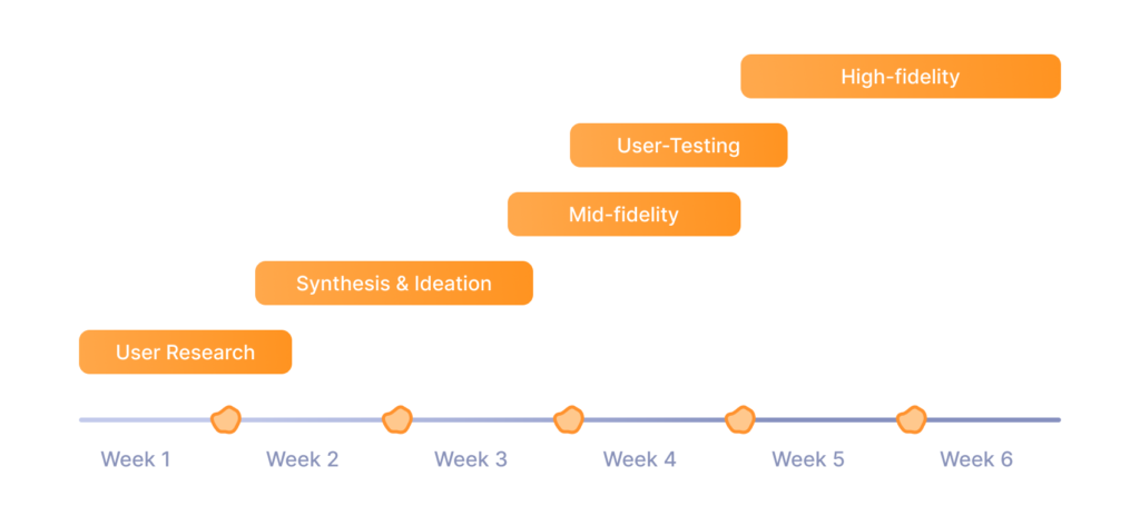
In the winter of 2023, I spent 6 weeks working with a team on an intensive design sprint for Design Interactive at UC Davis. We were tasked with creating an application that solved current issues with student housing.
Check out the final case study on Medium.
ROLE
User Research, Visual Design, Interaction Design, Branding
RESULTS
Awarded best user-centric design
Presented to UX leaders at Paramount, Apple & Sol
PROGRAMS
Figma, Adobe Illustrator
DURATION
6 weeks
Meet the team

💡 The Problem
Finding affordable, safe, and convenient off-campus housing is a reoccurring challenge for college students.
Design Challenge
How can we streamline the housing search for students by uniting renters, roommates and landlords in a simple, easy-to-navigate platform?
Introducing Spots
A user-friendly housing app that streamlines off-campus rentals through social networking features. This platform allows users to...
01
02
03
Connect with potential roommates
Explore vetted properties
Directly communicate with landlords
The Process
Project Goals
Streamline housing search
Offer vetted listings
Provide safe, reliable housing options
Personalize matches
Use quizzes for tailored roommate and property connections
Empower with information
Give students essential renting guidance in a simple format
User Research
Lit Review → Comp Analysis
Key Strengths:
Most housing apps have an intuitive, easy-to-use interface.
Listings provide detailed specifics on accommodations, restrictions, etc.
Key Weaknesses:
Lack of crucial information about leasing dates.
Absence of platforms that allow potential housemates to communicate directly.
Possible Improvements:
An FAQ page could be added to answer common questions students have during their housing search.
User Research
Research Goals
Accessibility & ease of use
Investigate the primary challenges and barriers students face in using housing search platforms
Functionality preferences
Determine what features (i.e. roommate matching, communication with landlords, property reviews) users prioritize in a housing app
Understanding user needs
Explore what drives student decisions when choosing housing and roommates, focusing on diverse needs and preferences
Inclusivity in housing searches
Assess how to make our platform more inclusive, catering to students from varied backgrounds and with different housing requirements
Ethical & secure use
Identify strategies to ensure ethical use of data and maintain user trust and security, especially in the context of personal housing information
User Research
Quantitative data: Surveys
We conducted a focused survey using Google Forms to gather student insights on off-campus housing searches. Our survey, featuring multiple choice, Likert scale, and open-ended questions, aimed to pinpoint key factors in housing and roommate selection. We also gauged the frequency of property visits and use of mobile apps vs desktop applications in the housing search process.
Our key findings were...
80%
73%
90%
90%
of students highlighted affordability as a major housing challenge
emphasized proximity to campus as a deciding factor
cited cost as a high priority
of students preferred using desktop for housing searches
User Research
Qualitative data: Interviews
Our team conducted 12 interviews to get more specific insight into individual thoughts and processes when finding off-campus housing. We asked students about what steps they take when researching housing, and roommate selection. We also gauged the frequency of property visits and use of mobile apps vs desktop applications in the housing search process.
Ideation & Synthesis
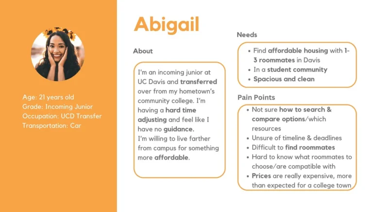
User personas
Based on the findings we received from our initial research, we found that the audience we were catering to were college students, particularly freshman and transfer students. Our user personas compiled the insights that we found most similar amongst our participants, including their goals, needs and pain points. Based on the information gathered within our user personas, we established what visualization tools and content design we would move forward with and began to think about how our users would interact with the application.
Ideation & Synthesis
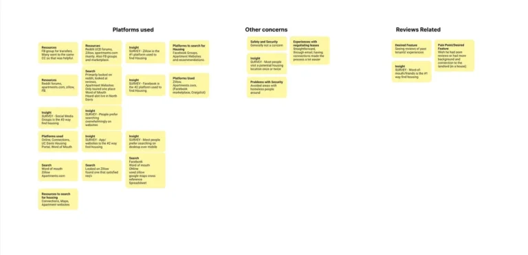
Affinity mapping
After affinity mapping, we synthesized potential features from the research insights. Our interview findings led us to determine which pain points we would address in our design and application. from here we found our focus in pricing, sociability, accessibility, comparability, transparency, and creating a resource hub.

Lo-fidelity
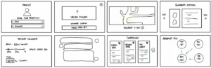
Initial sketches
Our first wireframes were initial steps we took in developing a user centric application. We all came up with designs based on our findings, then shared and compared with the rest of the group. This step was successful because of how much insight we were able to gain. From here, we had a solid starting point to design and organize content within our application.
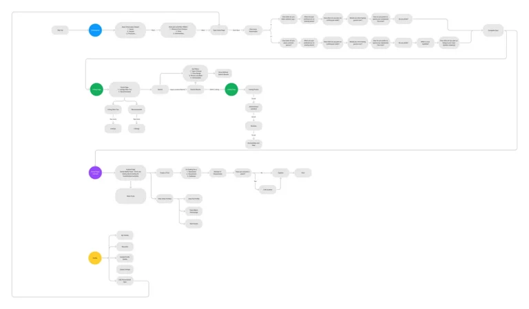
Lo-fidelity
User flows
Mid-fidelity
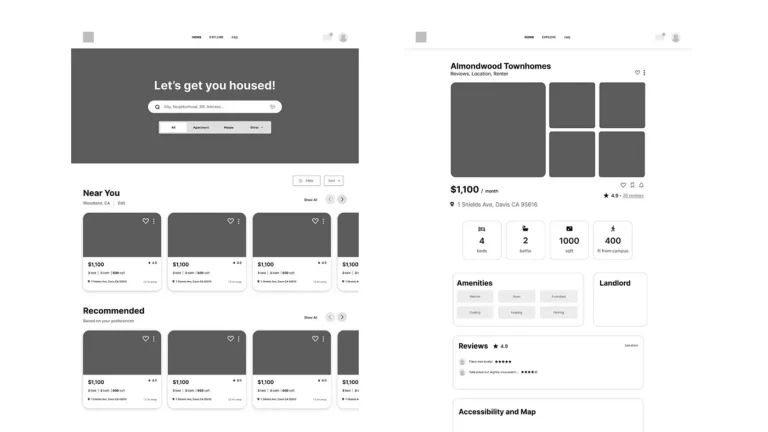
Home & Property pages
After finishing the onboarding, users land on the Home page. Here, they can explore a variety of housing listings tailored to their preferences. Users can view details of each property, compare options, and even contact landlords directly. The Home page serves as a central hub for all housing-related searches, offering an intuitive and user-friendly experience.
Mid-fidelity
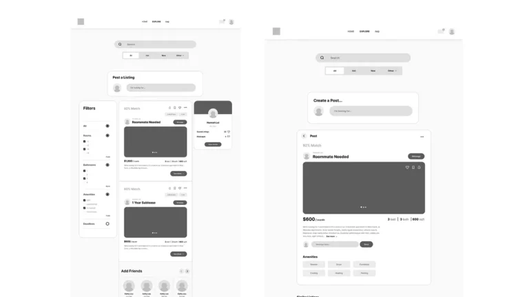
Explore page
The Explore page is where users engage with the social aspect of Spots. Here, they can browse posts from other students, share their own housing experiences, and connect with potential roommates. Each post offers details and the option to communicate, fostering a community-driven environment for housing searches.
Mid-fidelity
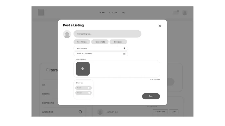
Create Post form
For our Create a Post feature, we introduced a seamless way for users to share their housing needs and preferences with the Spots community. This form allows users to craft detailed posts, complete with photos and property information, to connect with potential roommates, sublease opportunities, and more. This user-friendly interface empowers users to effectively communicate their housing requirements and engage with others in their housing search journey.
Mid-fidelity
User testing
We conducted user testing on our mid-fidelity prototype with 5 participants. Each user was tasked with:
- Completing the onboarding process and compatibility quiz.
- Accessing and reviewing the ‘Home’ page.
- Searching and viewing property listings.
- Messaging a landlord.
- Navigating to and interacting with the ‘Explore’ page.
- Messaging a potential roommate.
Mid-fidelity
Actionable takeaways
In response to user feedback, we made significant changes to our website’s layout and naming conventions. Originally, our “Home” page was set up like traditional property listing sites, featuring official housing properties. The secondary “Explore” page focused on social media, where users could post and connect with potential roommates. However, this setup was confusing for users. Feedback also emphasized the importance of our unique feature — the social aspect of the platform. Consequently, we renamed the “Explore” page to “myFeed” and the “Home” page to “Properties.” “myFeed” was repositioned as the primary homepage, placing our platform’s distinctive social networking feature at the forefront. This adjustment better aligned with our objective of highlighting the unique social interactions our platform offers, reflecting key, actionable insights from user feedback. Users also found the “Post a Listing” on the “Explore” page confusing and obstructive. To address this, we moved elements upwards and removed the Post a Listing widget to improve the user experience and enhance platform clarity.
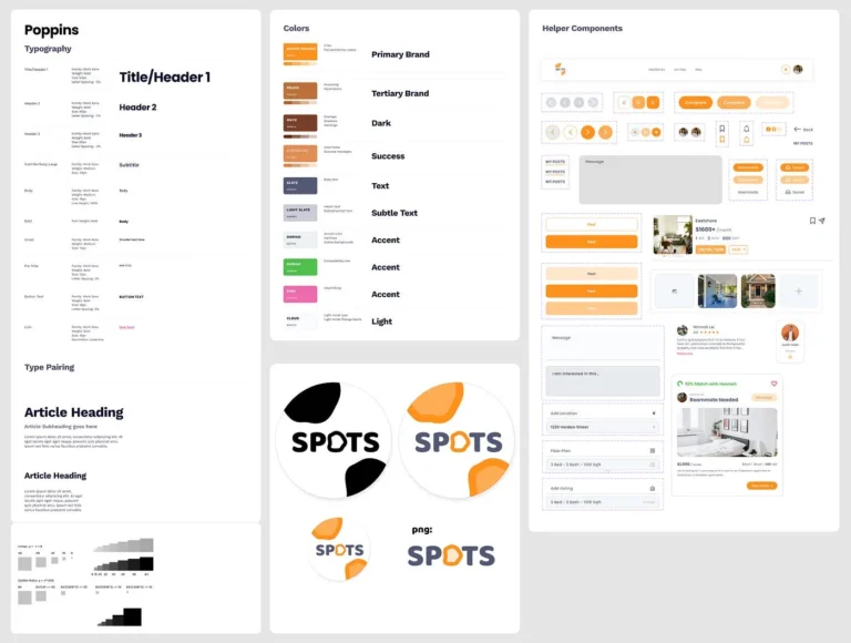
Hi-fidelity
Design system
Our design system incorporates orange for its energetic and inviting qualities, adding vibrancy and visibility. Brown brings stability, warmth, and a connection to nature. Together with green and light blue, our palette creates a harmonious and inviting design that aligns with our user-centric approach.
Hi-fidelity
Onboarding
Our onboarding process is designed to create a personalized user experience right from the start. It begins with a brief introduction to Spots, followed by a compatibility quiz. This quiz asks about lifestyle choices, sharing preferences, and housing needs, helping us match users with ideal roommates and properties. By gathering these details early on, we ensure that users see housing options that best fit their specific requirements.
Hi-fidelity
MyFeed
In the final MyFeed page, users can seamlessly explore posts from fellow students, complete with photos and property details. The compatibility percentage helps users find ideal roommates or properties, and the messaging feature allows direct communication. Users are able to favorite posts to be viewed later in their Profile. Users can also create their posts and access linked listings, creating a vibrant and interactive community hub for housing searches.
Hi-fidelity
Properties
The Properties page allows users to effortlessly browse housing listings, both houses and apartments. With a map-based search, users can explore available properties and click into each one to access detailed information. This includes past tenant/student reviews, apartment amenities, various pricing options, additional fees, and location details such as proximity to campus. Users can also contact landlords for houses, view upcoming deadlines and openings, and save listings for easy reference, providing a comprehensive and user-centric housing search experience.
Hi-fidelity
Profile
Navigating to the Profile page, users can easily access their personal information from onboarding, allowing them to review and update their preferences. They can upload a profile picture for a personalized touch. Users can also retake the compatibility quiz to refine their roommate and property matches. Additionally, this section offers a consolidated view of saved listings, favorited posts, and drafted and posted content, providing a one-stop destination for managing their housing search activity and profile details.
Hi-fidelity
Create a Post
Finally, on the Create a Post page, users have a dynamic form that adapts based on their preferences. Whether they have a property to offer or are looking for one, want roommates or tenants, or specify the type of property, the form guides them accordingly. Users can fill in property details, choose their posting audience (friends, public), and even save drafts for later. This versatile tool streamlines the process of sharing housing needs and preferences, catering to a wide range of user scenarios.
Presentation
The big day
On presentation day, we presented our UX journey and final high-fidelity prototype to the Design Interactive community and judges from Meta, SoFi, and Paramount. Our 10-minute presentation highlighted our user-centered design process and innovative solutions to address real-world challenges in the realm of college housing. It was a culmination of our dedication, creativity, problem-solving and teamwork to creating a meaningful and user-centric product.
Presentation
Positive Feedback
Our judges provided highly favorable feedback on our presentation, appreciating Spots as an effective solution to a real issue in college housing. They commended the user interface for its clarity and user-friendliness, and the color scheme was noted for its visual appeal and consistency. The judges expressed that they would personally utilize the website for college housing needs, affirming the platform’s practicality and appeal for the intended audience. Overall, the feedback underscored the project’s success in merging innovation, functionality, and aesthetic design in Spots.
Presentation
Constructive Feedback
We received constructive feedback on our Lo-Fi Sketches presentation, indicating areas for improvement. Suggestions included enhancing the visual quality of the sketches to improve clarity and coherence. Additionally, there was advice to reconsider the size of the buttons on the interface; they need not extend across the entire page. This feedback points to an opportunity for a more refined and streamlined design, focusing on a balanced and visually appealing layout. These insights are valuable for refining the user interface, guiding us towards a more polished and user-friendly design in future iterations of the project.
Next steps
1. Responsive design:
Working on a mobile app as our current design utilizes a desktop design only, bringing on-the-go convenience to our college demographic.2. Micro-interactions:
Missing subtle animations to enhance user experiences and make the interface more engaging.3. Research:
Gaining a better understanding of what design trends are being used in other housing or roommate applications.