ease guides users experiencing loss to find peace and purpose in their grief.
In the spring of 2023, I spent 6 weeks working on an intensive UX design project at UC Davis. My only prompt was to create something that solved an issue and helped others in some way.
ROLE
User Research, Visual Design, Interaction Design, Branding
PROGRAMS
Figma, Adobe Illustrator
DURATION
6 weeks
Losing someone is one of the most difficult experiences we go through as humans.
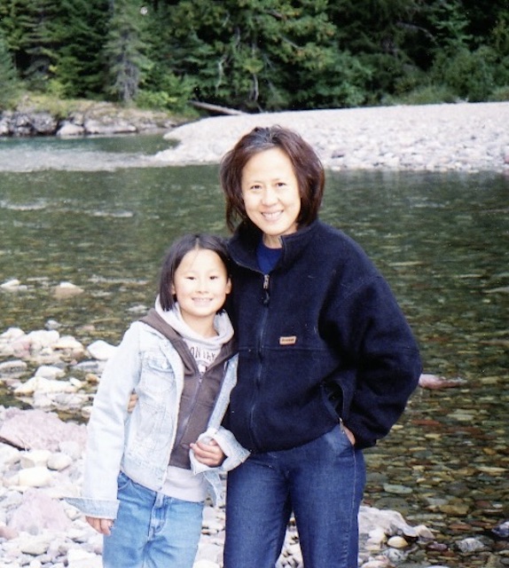
When I was 19, I lost my mother to lung cancer. It was the most challenging experience of my life, and for a long time, I struggled to regain my footing. I felt stuck.
With time, a strong support system, and persistence, I eventually experienced profound personal growth. I learned that grief is complex and unique to each person. My hope is that anyone who loses a loved one can navigate their grief healthily and emerge stronger. Our loved ones would want us to be happy and thriving, but it's often hard to know where to begin.
💡 The Problem
Many struggle with the complex and overwhelming emotions associated with loss and are unsure of how to healthily navigate their grief.
How might digital technology help people have a healthier relationship with death and grief?
Design Challenge
Introducing Ease
A grief support app that helps individuals find meaning and purpose in their loss through personalized guidance and community support. This allows users to...
01
02
03
04
Set goals and track progress
View and share stories
Join communities and volunteer
Access resources about grief and a healthy lifestyle
In a society that often seeks to evade the topic of death, embracing our mortality can lead us to live more consciously and prioritize what truly matters.
Research
Getting an idea
For the Ease app project, I researched and brainstormed various topics, ultimately focusing on grief support. I discovered that while many mental health apps exist, grief and loss are underrepresented and often stigmatized, making it hard for people to seek help and share their experiences. I conducted a competitive analysis, interviewed individuals who have experienced loss, and created user personas to guide my design decisions.
Lo-fidelity
Initial Wireframes
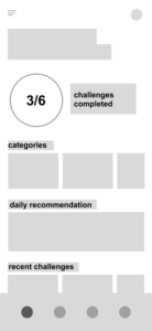
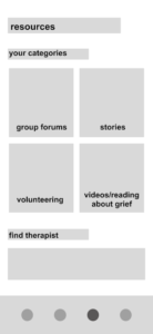
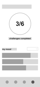
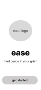
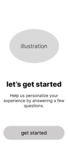
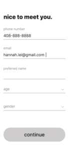
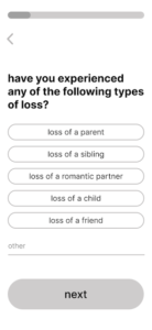
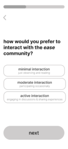
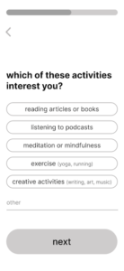
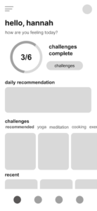
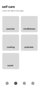
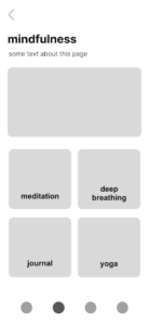
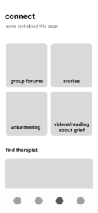
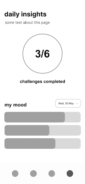
To better visualize the grief app and incorporate my research findings, I designed low-fidelity wireframes. This process helped me brainstorm the user flow, determine essential pages, and plan app features and layout.




Mid-fidelity
Solidifying Features
For mid-fidelity, I developed a more cohesive and detailed version, focusing on key pages and iterating based on peer and professor feedback. I carefully considered layout and navigation to ensure a user-friendly experience.

Design System
Moodboard
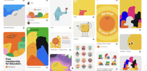
I created a Pinterest moodboard to gather inspiration for the visual branding and ambiance of my grief app, aiming for a comforting and supportive feel. I also looked at mental health apps for examples to guide my design choices.
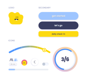
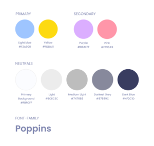
I chose bright and cheerful colors, particularly yellow, and considered cute characters to evoke a sense of playfulness and a child-like spirit, helping to both uplift and comfort users during difficult times.
Design System
Style Guide
I put together a moodboard to inspire my design and layout of the application.
Hi-fidelity
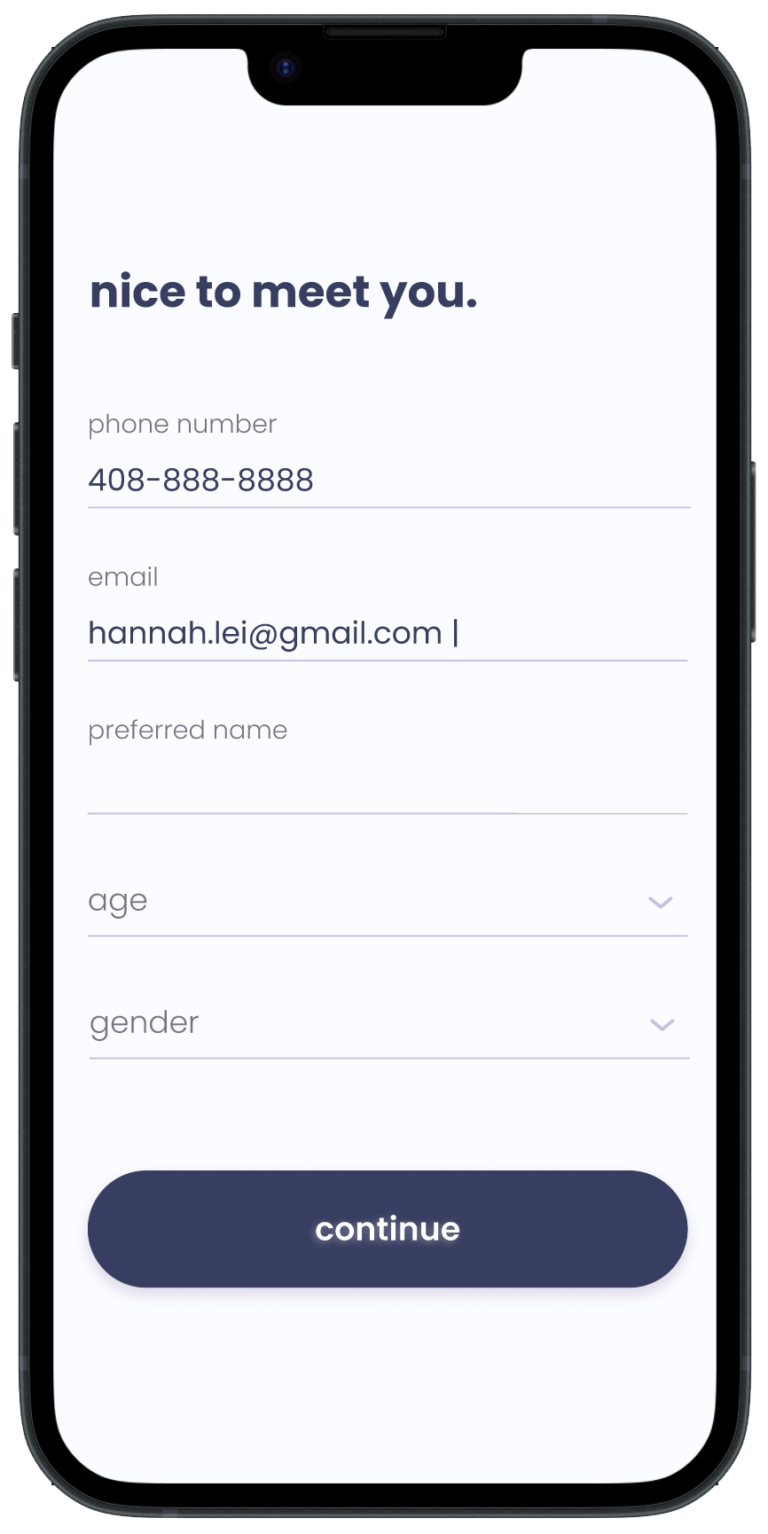
Create Account
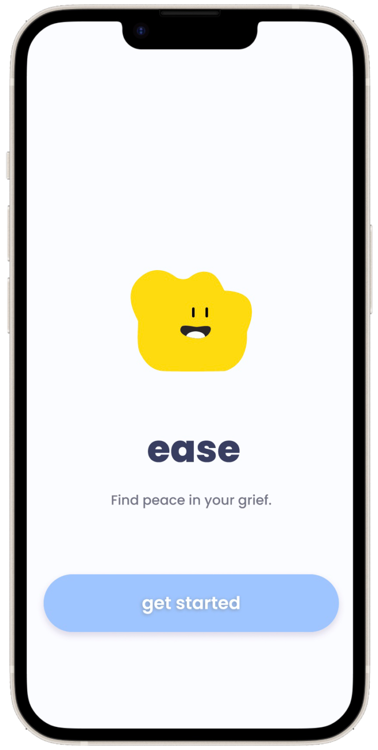
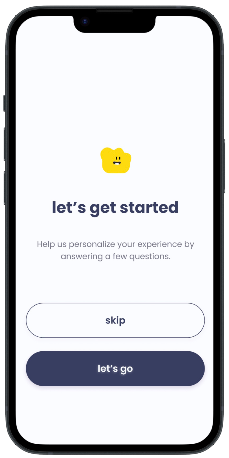
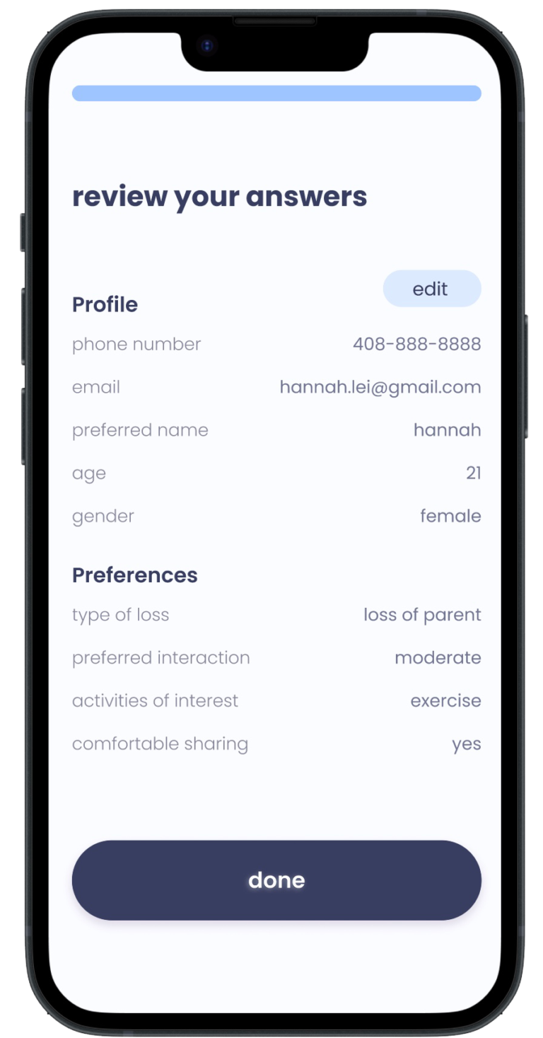
I implemented the final design using the research, inspiration and design system presented. When first opening the app, users will be prompted to create an account and asked to take a quiz.

Hi-fidelity
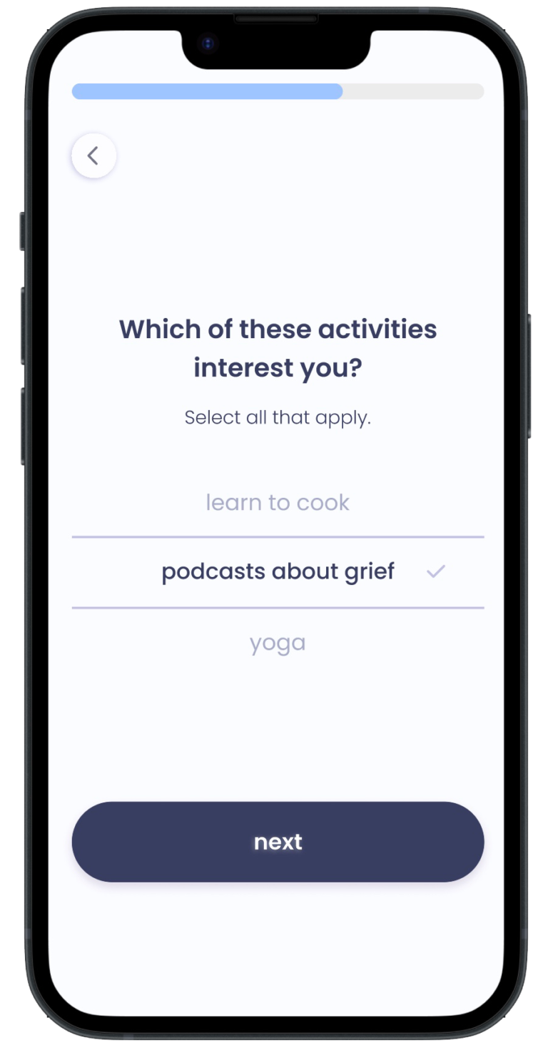
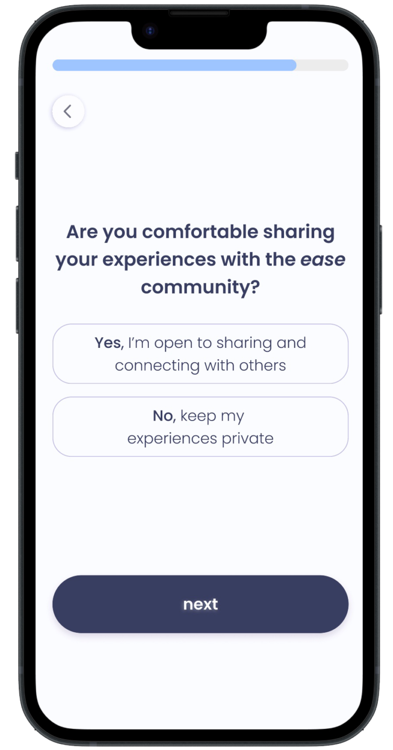
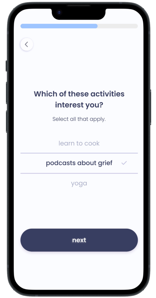
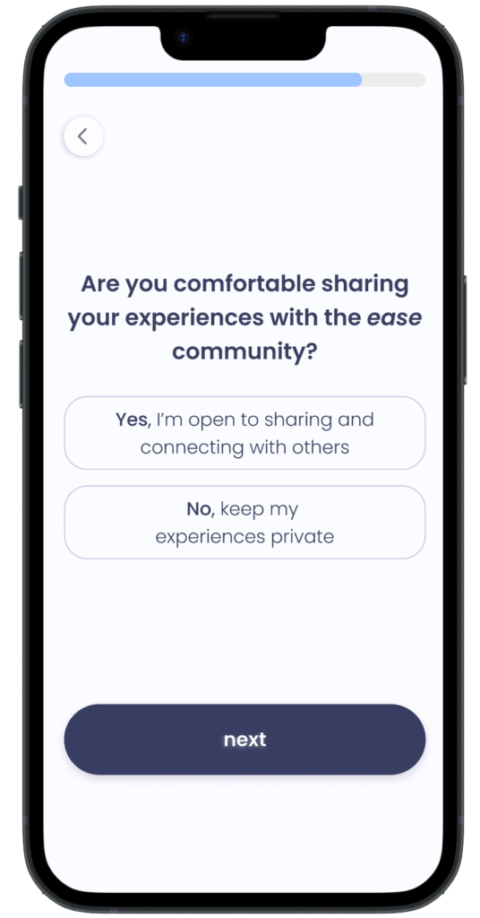
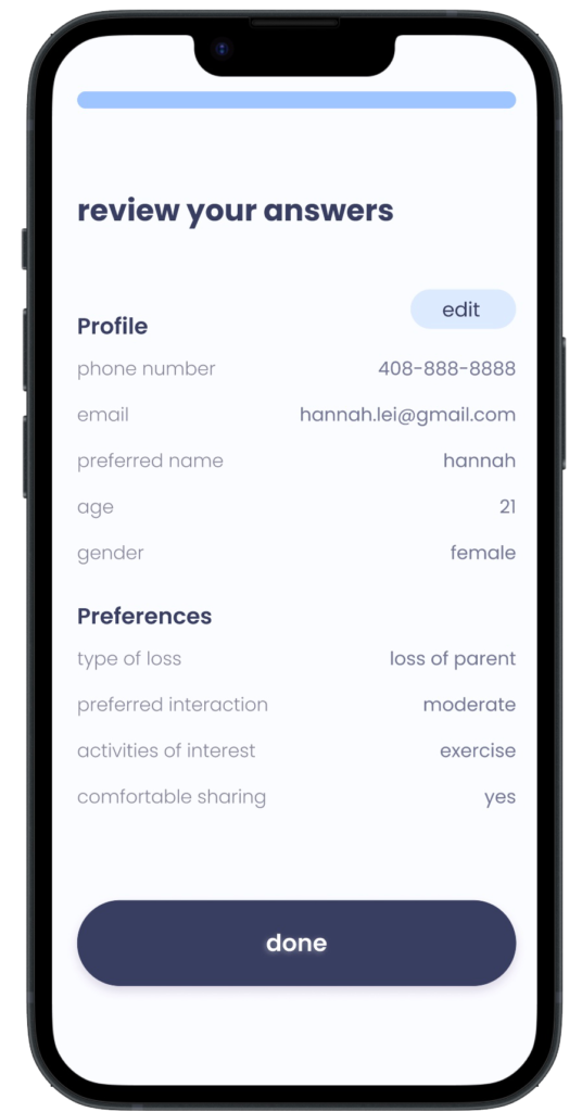
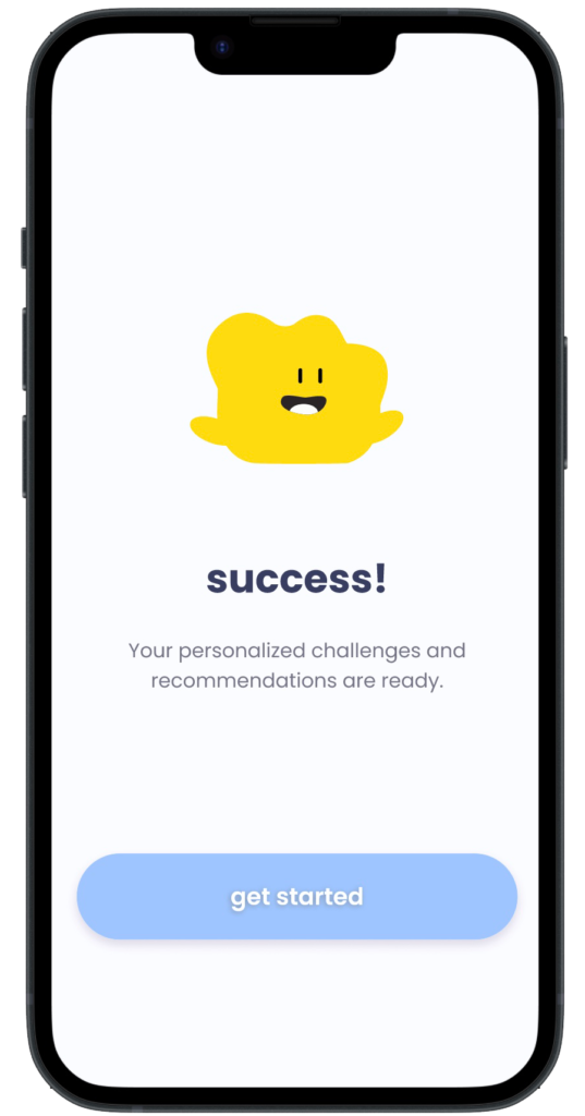
Personalized Onboarding
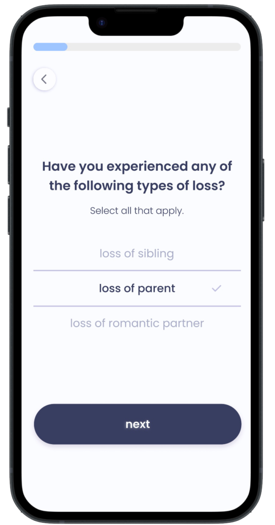
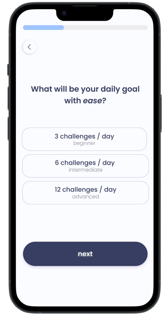
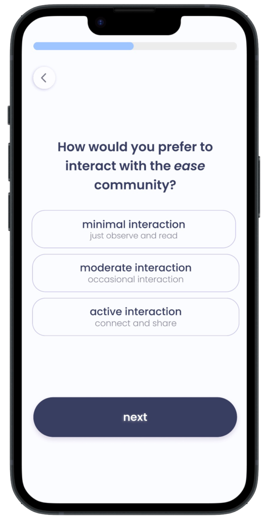
The onboarding process includes a quick questionnaire that makes the app experience personalized to the user and their grief journey.
Hi-fidelity
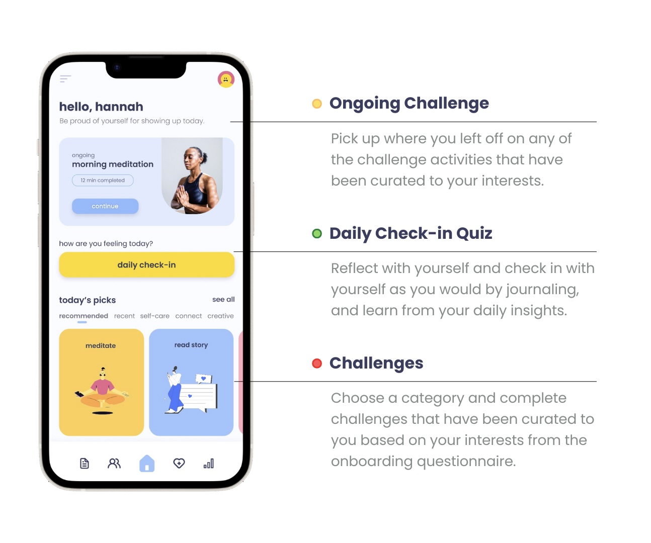
Dashboard
Users will be directed to the homepage after onboarding.
Hi-fidelity
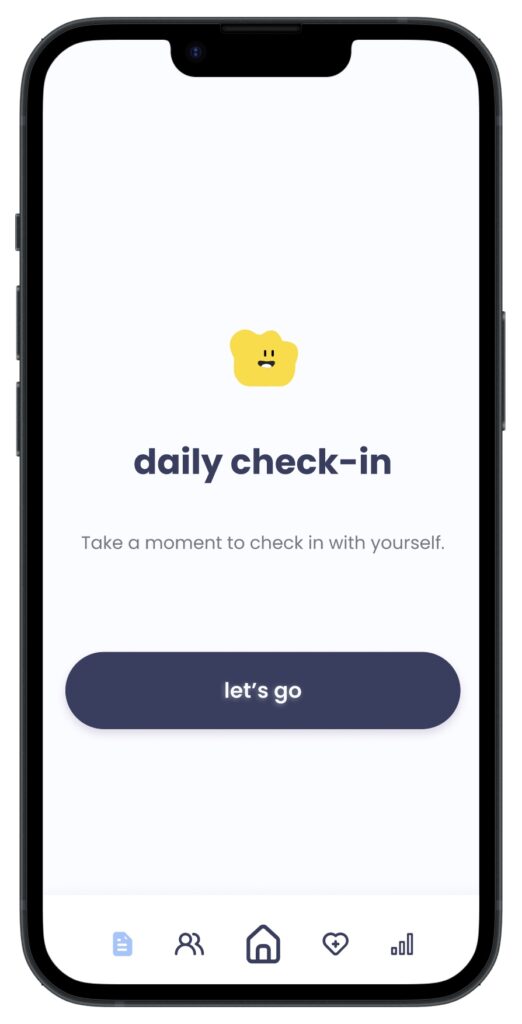
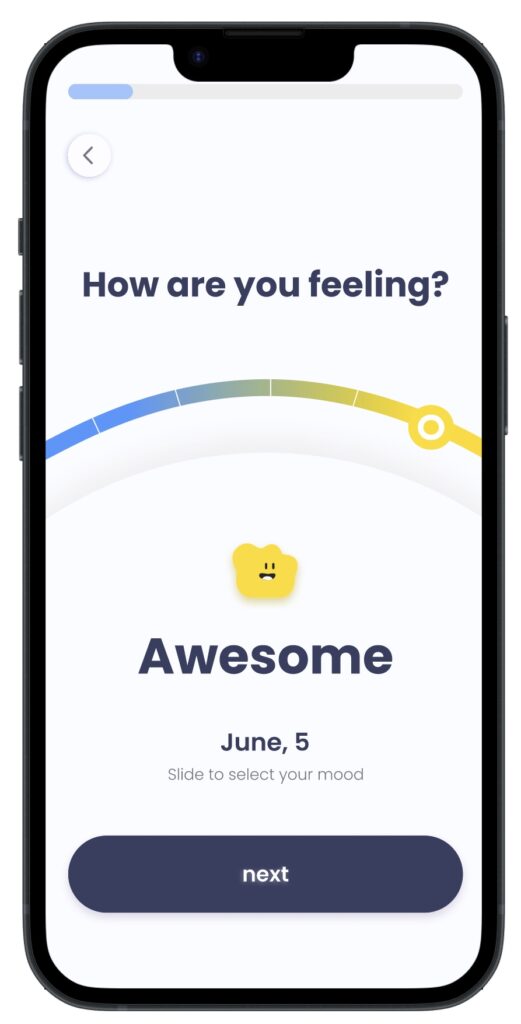
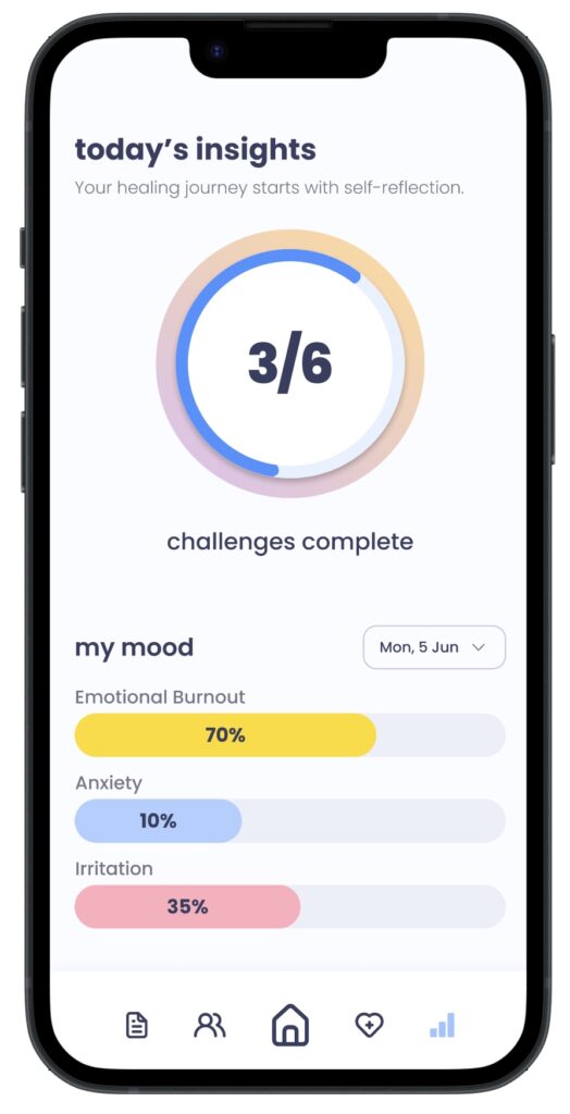
Tuning into Emotions
The daily check-in and insights allow the user to better reflect and understand themselves and their emotions. This is similar to journaling and builds strength and growth in the grieving process.
Hi-fidelity
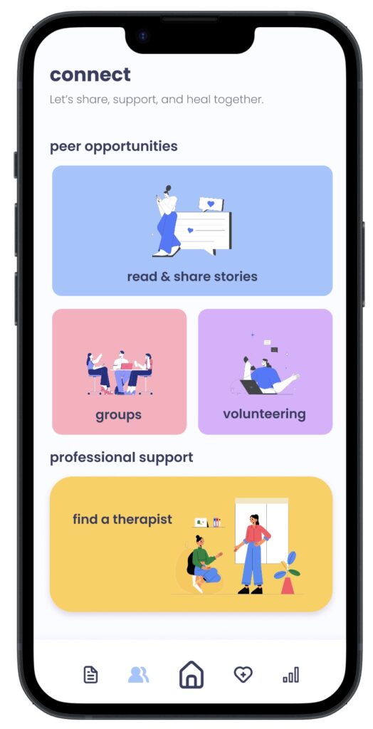
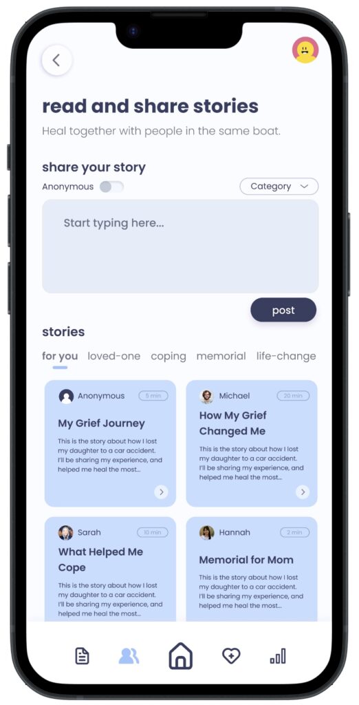
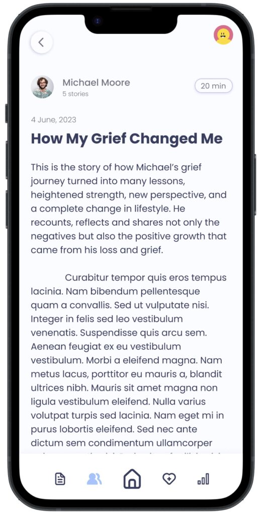
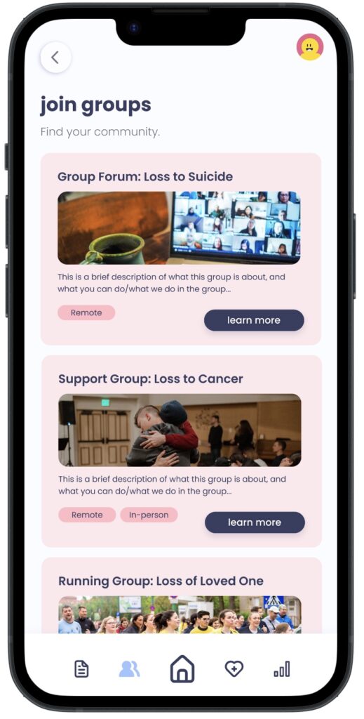
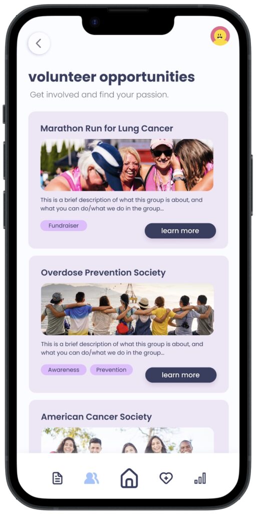
Support Network
Ease provides a community of people who have endured loss to share their stories with each other. It also connects users to support groups, volunteer initiatives, and therapy.
Hi-fidelity
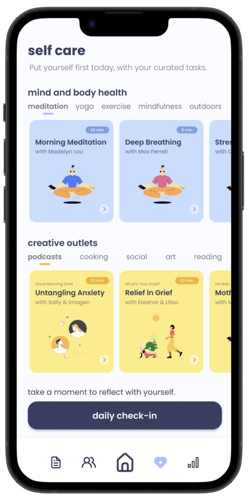
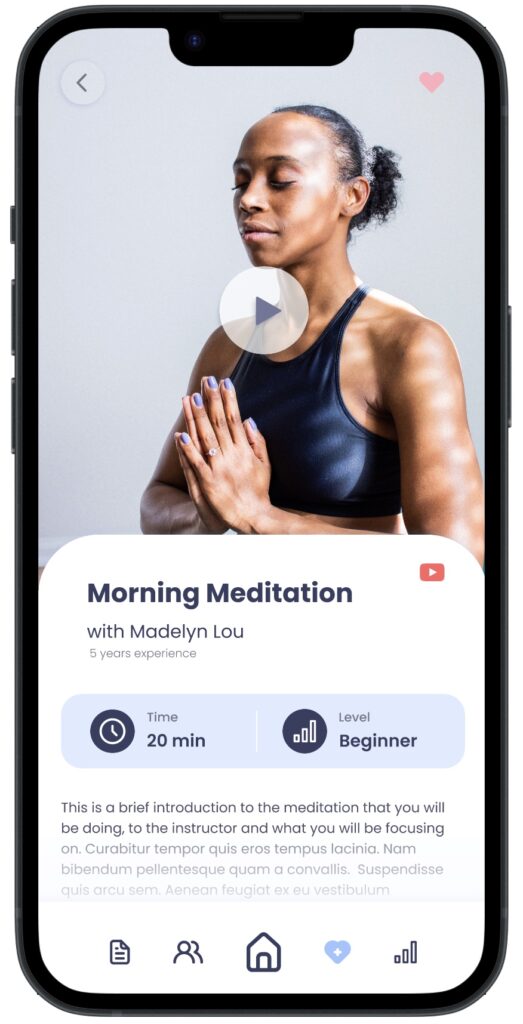
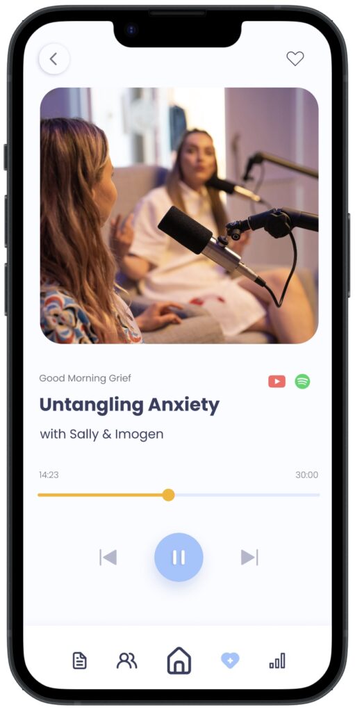
Motivating Self-Care
Ease uses challenges to bring a game-like aspect to the app and encourage active participation. Challenges are healthy and doable outlets that are curated based on onboarding.
Next Steps
This project is incredibly meaningful to me. Leading the UX process for a large-scale project on a tight deadline helped me grow significantly as a designer. Ease was a capstone project that marked a turning point in my journey as a designer, as I began to fully realize my style and became more capable of handling the entire UX process on my own.
Looking back, there are many visual, layout, and functional changes I would make as I’ve continued to grow and learn since completing ease. I would like to turn this concept into a reality. I want something like ease to exist to help those going through loss.