AMP enables users to find and pay for campus parking quickly and easily.
This project was a 3-day intensive design challenge to apply for Design Interactive at UC Davis. In this challenge, I implemented the UX process and delivered a polished prototype within a short time constraint.
ROLE
User experience design, visual design, branding
RESULTS
Accepted into Design Interactive’s competitive cohort Showcased improved version of AMP
PROGRAMS
3 days
DURATION
3 days
💡 Our Prompt
The UC Davis AMP Parking app represents a promising step towards a more streamlined and convenient parking experience on campus.
In its early stages of development, there are currently several functional challenges associated with finding and paying for parking, particularly in the Davis area.
The Challenge
How might we redesign the UC Davis AMP Parking app to enable users to easily locate and navigate to available campus parking areas to facilitate quick and simple payments?
Research
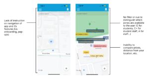
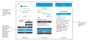
Initial Impressions
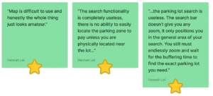
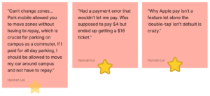
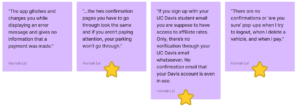
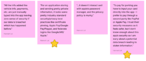
To kick off the research process and gauge what direction my redesign would take, I dove into the user experience of the existing AMP mobile app. I then took notes on each of its pages about which aspects were lacking and could be improved on in my redesign. Below are my resulting notes with screenshots from the original AMP app.
User Research
Interviews
I conducted interviews with 10 Davis students & residents to discover why, where, and when users struggled with locating available parking, along with managing in-app tasks like viewing parking stubs and editing profiles. From the interviews, I created actionable insights that informed our redesign, which introduces a more intuitive dashboard and streamlined navigation to directly alleviate these issues.
= push later
= actionable
Navigating the interface is unclear and unappealing
Map and search bar are not very functional or helpful
Payment process is under-developed and has errors
Lack of user feedback and confirmations
Security and privacy is weak and not trustworthy
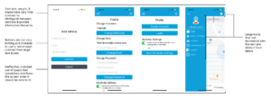
Lo-fidelity
Initial Sketches
Before reaching my final design, I sketched out iterations of the onboarding page, sign up form, landing page and parking form. I stayed mindful about keeping the user flow clear, functional and specific to issues that users had experienced.
Mid-fidelity
Final Iterations
After finalizing the layouts and user flows that seemed most effective out of my initial sketches, I implemented the designs into mid-fidelity prototypes on Figma. Most of this process consisted of iteration after iteration.
Hi-fidelity
Final Design
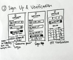
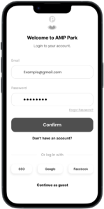
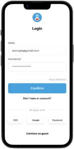
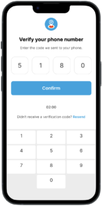
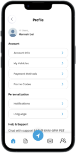
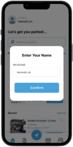
Quick and easy signup and login process that prioritizes security.
Hi-fidelity
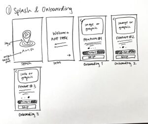
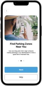
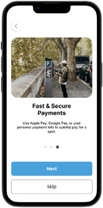
Onboarding
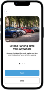
The onboarding process introduces key app functions for easier navigation.
Hi-fidelity
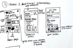
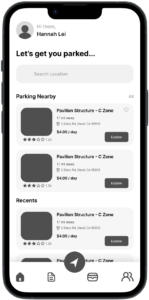
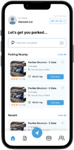
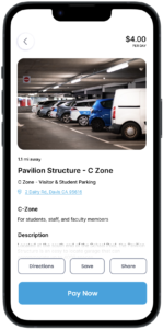
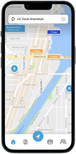
Finding Parking
Users can easily find parking based on their location or recent activity using maps, search, or explore features. The app allows filtering and favoriting parking areas, and provides accessible reviews, directions, and other information for each spot. Reserving a parking spot is streamlined with a one-click process available across multiple app sections.
Hi-fidelity
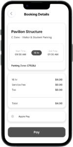
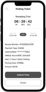
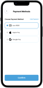
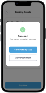
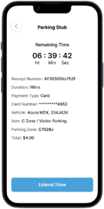
Payment and Booking
Users can quickly input vehicle details, select the date and duration of their parking session, and opt for a 15-minute reminder before it ends. They can add or use saved payment methods, receive clear booking details, and get payment confirmation. Users can also edit the duration of their session and view an active timer showing the remaining time.
Reflection
Working solo, I was my own team and managed every aspect of the project. The rush taught me to focus on the essentials and accept an imperfect, iterative process.
I learned to assess an existing platform’s strengths and weaknesses to make thoughtful improvements. Analyzing user reviews also pushed me to understand the user more deeply.
This challenge helped me learn to prioritize key aspects under tight deadlines and embrace the circular nature of design – plus I had a lot of fun!